Perception of reality and how things work
Let’s start with defining what mental models actually are. A mental model is a cognitive construct built on past experiences and beliefs. It is a prediction of the reaction of a system to a performed action. Through the habitual use of the high number of products that exist today, a user’s brain develops mental models for how products work. Users will transfer experiences they have built around one familiar product to another that appears similar.
For example: If I click on the “envelope button” of the website, a contact form will appear. It is important to note is that a mental model is the perception of how things work and not necessarily how they work. Mental models can vary from stakeholder to stakeholder and very often they are not really verbalized or formalized. They are so to say what everybody somehow knows but rarely talks about. Mental Models can change over time through education and training.
They are in flux and offer therefore a vehicle for change.
When mental models clash
Mental models are often very similar in groups of users who deal with similar topics or have a similar level of experience in a field such as ‘supermarket shoppers with small kids', ‘e-commerce shoppers’, ‘technicians’, ‘marketing people’ and so forth. Further, one of usability's most present and much discussed dilemma is the gap between designers' (marketers, business owners and so forth) and users' mental models.
We want to integrate a different and very relevant mental model, which is able to influence design processes significantly: the businesses/ brands mental model. In our strategic work we frequently realize that the ‘internal’ business perspective (driven by business goals) and the ‘external’ user/customer perspective (need-oriented) are something completely different. These different ‘frames of reality’, contradictory perceptions and beliefs, result in different mental models. A clash for each usability.
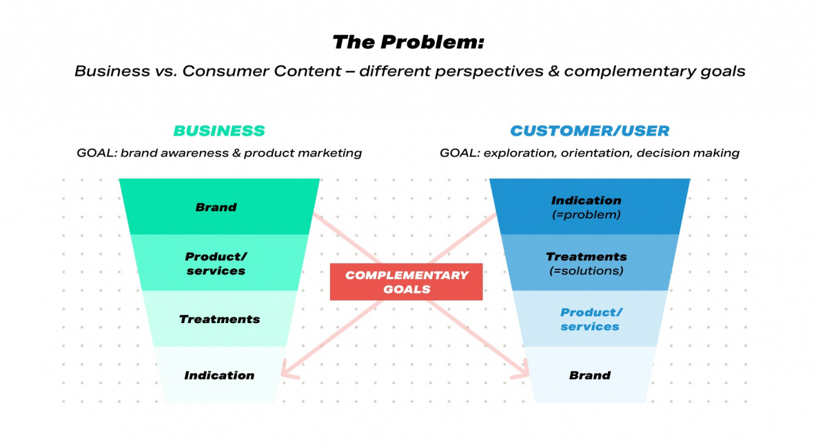
Instead of fighting these different mental models we want to acknowledge them and at the same time encourage the business and client users to take on the perspective of the other side. We need to know both perspectives in order to be able to be customer-centric. This does not mean giving up the company/employee point of view, but it is important to learn how it is connected or disconnected from the perspective of the user.
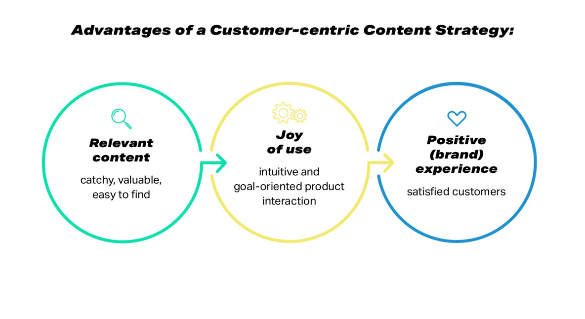
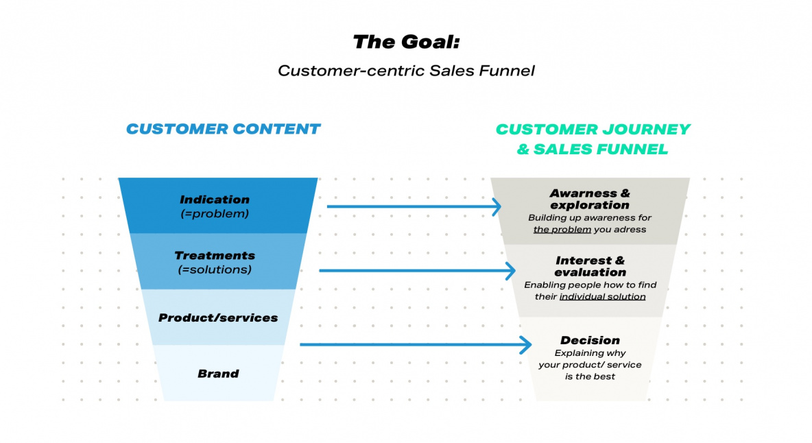
For example, for both stakeholder groups ‘brand’ has a place in their mental model. However, ‘brand’ is positioned in contrary order of priority. That means that the context and importance of ‘brand’ is for users and businesses quite different. The goal is to link the customer’s mental models to content strategy so that the customer sees in his path through the sales funnel relevant content.
A business case: avoiding usability problems with the help of mental models
Exploring mental models by research:
To make the topic easier to understand, we would like to introduce a business case from the beauty & cosmetic industry. Our task was to develop an appealing website, which works smoothly and intuitively with relevant content for cosmetic products and treatments. Here we tapped into mental models through user research. With the “thinking aloud” UX testing method, users verbalize their expectations and questions while scrolling the client’s website. Through this research, we were able to determine users’ thought structures, and thus their mental models.
Designing on the foundation of mental models:
In the first step mental models help us to identify relevant topics: questions that we should definitely answer and concerns that we can thus debunk. This knowledge helps us to evaluate, optimize, and structure existing content – in the form of a content inventory.
In a second step mental models help us to discuss the hierarchy of content and its infrastructure. Card sorting is a useful way to discover users' mental model of information architecture (=hierarchy) so that UX designers can structure and design your content and the navigation (=infrastructure) accordingly.
In the following example, we open up both perspectives on the topic: that of the business (internally), and that of the customer (externally). We provide insight into relevant content (here: relevant topics) and the infrastructure (here: website menu) for both sides. The list of “relevant topics” shows the hierarchization of topics in customers’ / businesses’ thought processes.
At the top are the first and most important thoughts and questions. Further down, one finds later, less relevant ones.
Customer mental model:
Getting familiar with the topic
- Curious in the latest beauty and cosmetic trends
- Think that treatments are expensive
- Think that some people are just overdone
- Look up to celebrities showing their treatments
- Fear that it might look not natural
Learning about treatment
- Create a continuous interest for a specific cosmetic treatment
- Learn about possible treatments
- Learn aesthetic vocabulary
- Seek entertainment with aesthetic content
- Compare ‘before and after pictures’
<Identifying treatments for yourself>
- Identify optimization spots on yourself
- Monitor overtime own body & face
<Seeking treatments>
- Thinking about a possible treatment
- Looking for a beautician
- Search for recommendations
- Lookup information about
- Evaluate/compare prices of treatments
- Decide to contact a beautician
- Make an appointment
- Consult the beautician
- Decide on a treatment
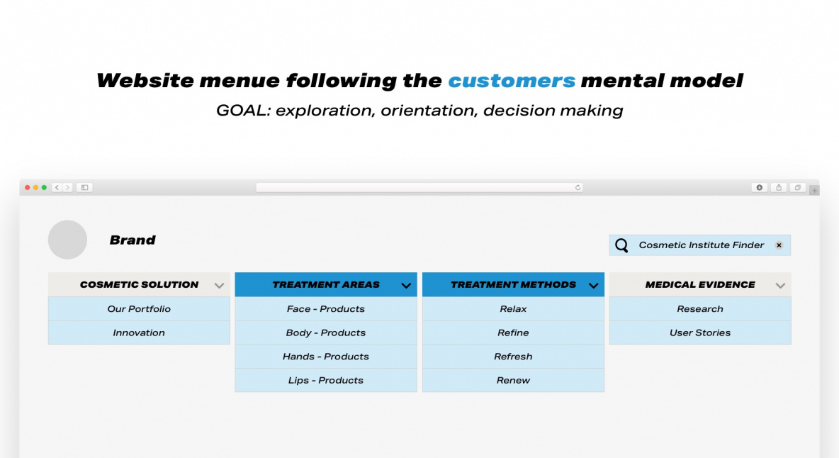
Looking at the customer mental model we could come up with the following website menu.
So, let’s switch sites and take a close look at the various business stakeholders and their thoughts, wishes and reflections.
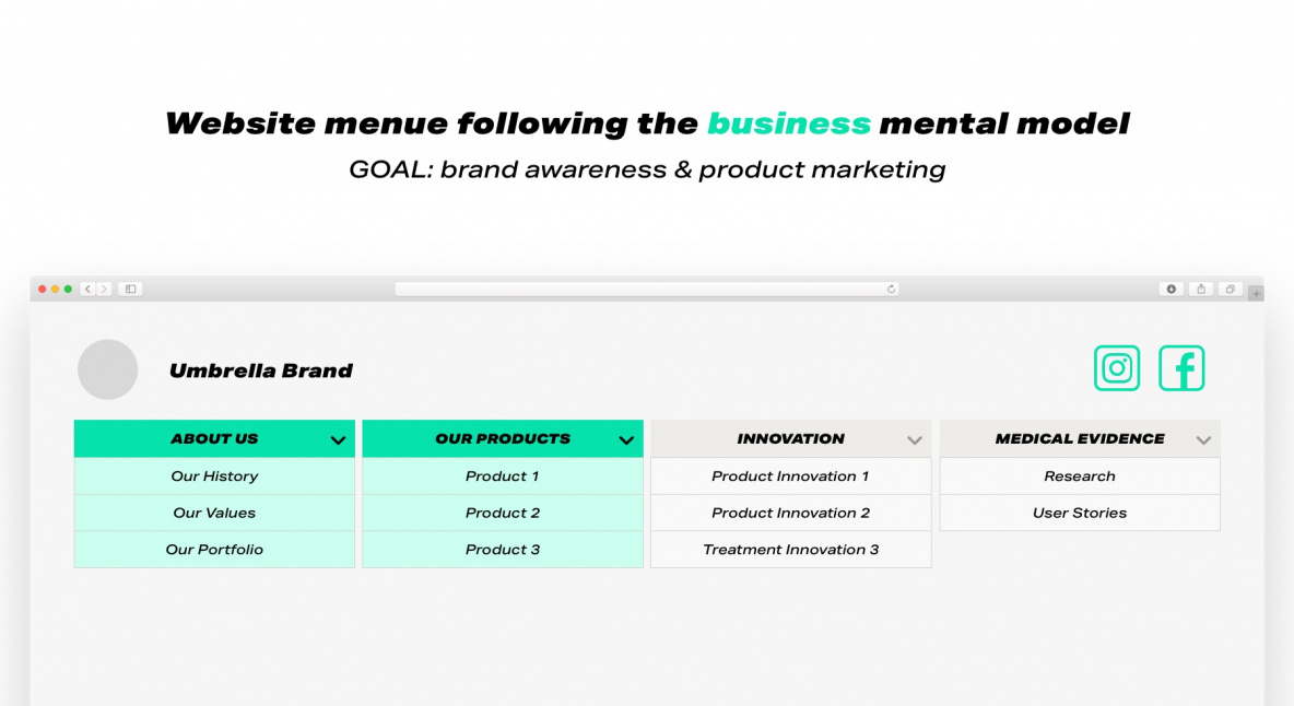
Business mental model:
<Company umbrella brand>
- Wish to strengthen brand awareness
- Communicate brand values
- Present brand heritage
<Marketing goals>
- Want to introduce portfolio marketing
- Communicate new BU structure
<Introduce product brands>
- Display the product brands
- Showcase different product brands’ visual identity
- Present (technical) product USPs
<Product in usage>
- Mention possible treatments
- Show product range with treatment options
- Showcase medical evidence
- Fear of legal claims
Looking at the business mental model we could come up with the following website menu.
Applying mental models to digital products
As you can see both mental models lead to completely different navigation. But which model is wrong? Fundamentally, neither model is wrong, but its effectiveness depends on the target group. If you wish to satisfy your internal business stakeholders, you obviously go for the navigation based on the business mental model. In case you want to be a truly customer-centric company you should choose the navigation based on the user's mental model. Sounds very simple, but unfortunately it often goes wrong, because many business decisions (and thus also the perspective of website communication) are decided from internal business "believes”. Often a faulty compromise gets introduced because the company wants to be user-centric, but at the same time stay focused on their business goals and KPIs.
The navigation of such a faulty compromise might look like this:
Faulty compromise website navigation
- Aesthetic Solutions
- Our Products
- Our Values
- Umbrella Brand
- Institute Finder
This navigation looks like many navigation systems, you find online mixing up those different mental models: They look familiar, but they do not serve the purpose: navigating a defined target group of users to relevant content.
Our strategy to overcome such faults is firstly to make mental models visible, raise awareness for these different mindsets, and acknowledge them. In the second step, we clearly define the target group of a communication/ marketing strategy and then strictly follow this perspective (e.g., with the help of representative personas).
We hope you do not get lost when next time you are confronted with different mental models. Instead, make them visible, acknowledge them and apply the one that is most relevant for this touchpoint. This makes user interface design intuitive, helps users to carry out their tasks target-oriented and with the best experience possible.
