
Introduction
One of Drupal's strengths is its ability to create structured content and manage how it is displayed across different contexts. The same content can appear differently depending on the situation: fields may be hidden, reordered, or rendered in various formats. For example, the main text field might be fully rendered on one page, trimmed when shown as a teaser, or completely hidden when displayed as a small teaser in a sidebar.
Content display UI can be a powerful tool for content editors, particularly when creating flexible and dynamic components. This article explores a method for streamlining the selection of view modes for nested paragraphs. The solution empowers content editors to control display settings from the parent component, simplifying content management while ensuring consistency across multiple elements. This approach significantly reduces the time and effort required to configure each individual item.
In this article, we will walk through the problem a client posed, the research and implementation of our solution, and the steps needed to set up a system where the parent component governs all nested paragraph view modes in Drupal.
The challenge
While working for one of our clients, we were required to create a multi-purpose component to display teasers with highlighted content. The teaser needed an image, a title, body text, and a call-to-action (CTA), with the text elements and CTA being optional. We had handled similar requests in the past, thus at first, it didn’t seem like a big challenge.
However, when we delved deeper into the client's requirements, they emphasized the need to display teaser elements with an image that could have different aspect ratios: 16:9, 4:3, or 2:1. Initially, we thought we could create a field for selecting the desired ratios from the child element's different view modes. Nevertheless, the client wanted to select the aspect ratio for all the teasers at once. In other words, when an aspect ratio is selected in the parent container component, it should apply to all teasers, instead of setting the aspect ratio individually for each teaser element.
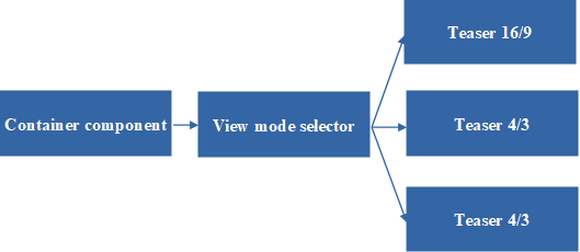
This was a bit more challenging since we hadn’t encountered this request before. Still, it made perfect sense in terms of saving content editors' time. Additionally, this approach would maintain visual coherence and uniformity within the container component.
We realized that this required some research to find an efficient solution that would also be user-friendly for content editors.
The solution
The initial approach was to search for a suitable module in the official Drupal module library (https://www.drupal.org/project/project_module) that could meet our expectations:
-
Compatible with the current version of Drupal (we were working with Drupal 10 at the time).
-
Constantly maintained (the latest code was uploaded recently)
-
Well-documented.
-
Positive feedback from the Drupal community.
-
A low number of open bug tickets.
The best candidate found was a module called “Paragraph View Mode” (https://www.drupal.org/project/paragraph_view_mode), created by Sayco (https://www.drupal.org/u/sayco).
The last version had been released in May 2024, with only six minor bug tickets open. It was constantly updated (approximately twice a year), well-documented, had good community feedback, and most importantly, it allowed content editors to dynamically choose the display mode for specific paragraphs. Perfect!
We normally install module dependencies via Composer, but there are alternative methods, such as using Drupal’s UI. As a suggestion, we recommend choosing whichever is most suitable for the project.
Previous work
Once the module was installed, some preliminary steps were necessary to implement the solution.
The first step was to create the image styles (/admin/config/media/image-styles) and responsive image styles (/admin/config/media/responsive-image-style) for each view mode: 16:9, 4:3 and 2:1
As developers, we’ll need to calculate in advance how large our images should be based on the breakpoints used in our project. Once calculated, we added the "focus point scale and crop" image effect, but the exact configuration depends on the project’s needs.
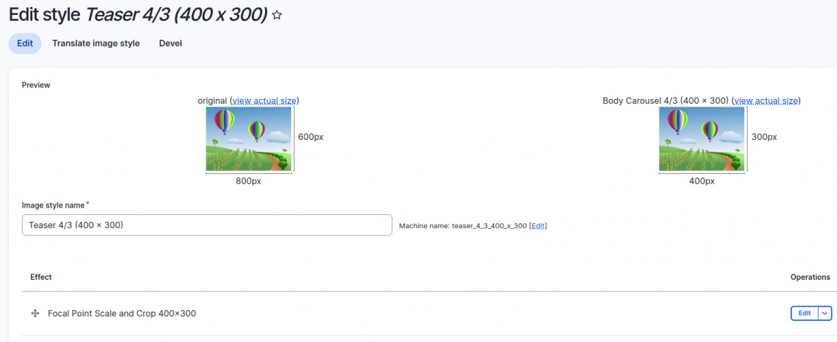
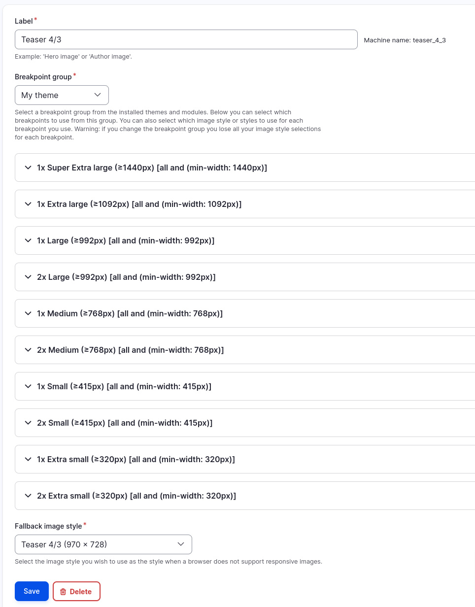
Once all the image styles are created, we need to group them within the responsive image style according to the project’s breakpoints.
These tasks can take a bit of time, luckily, we got a big cup of coffee!
Unfortunately, we weren’t done just yet. Next, we needed to prepare the image view mode to use these responsive image styles.
Let’s head to the display-modes section (/admin/structure/display-modes/view) and create custom view modes for media. We click the "Add view mode" button and select "Media" in the dialog.

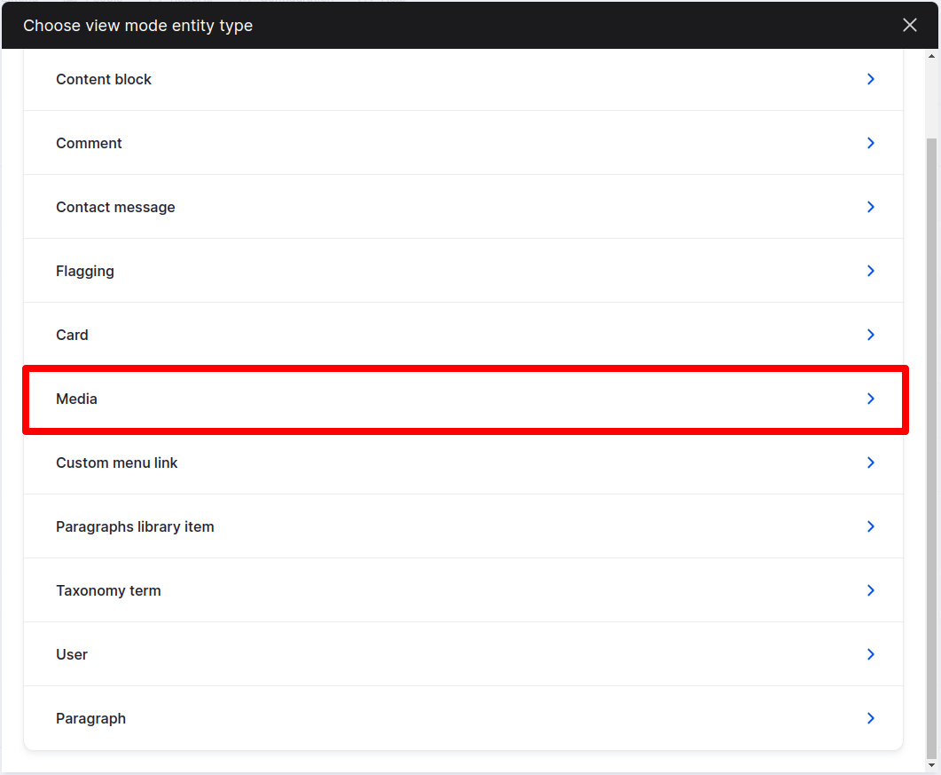
We add an appropriate name and description and enable the view mode for the media the teaser component will use, in our case, "Image."
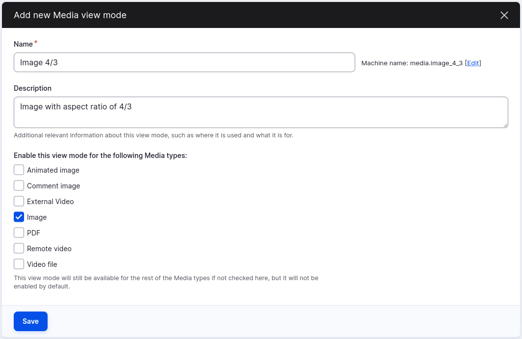
Let’s click "Save." We'll need to create as many view modes for media as we have responsive image styles.
Next step is to activate these view modes in the media image type (/admin/structure/media/manage/image?destination=/en/admin/structure/media):
We shall go to the “Manage display” tab.

Scrolling to the bottom, we’ll find a tab labeled “Custom Display Settings.” Let’s click on it.
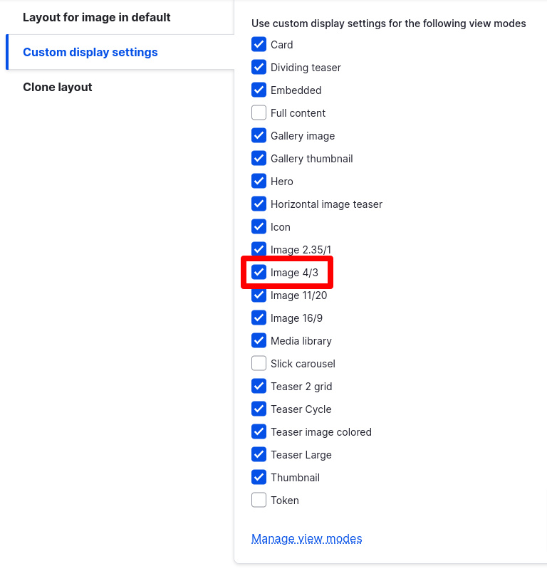
Then we proceed to enable the new view modes and hit "Save."
Great! Now our new view modes should be visible and manageable from the tabs at the top of the window.

Awesome! Let’s click on each view mode we enabled, selecting "Responsive Image" as the format, and choosing the appropriate responsive image style for that view mode. Also, we should set the "loading attribute" to "lazy" to improve site performance and Google Lighthouse scores, specifically because it is not a hero component, and it wouldn't impact negatively in those scores.
Phew! Those were the preliminary steps. Now it’s time to work on the teaser container component and the teasers themselves.
The teaser component
Although it might be tempting to start with the container component, as it’s the easiest, we should begin by creating the teasers to ensure everything is ready for the container component where the magic happens.
We’re not going to explain how to create the component itself because that would be a topic for another article. Instead, we’ll focus on the settings needed for the main purpose of this article.
For this component, we’ll need to add the same view modes we created for the media type image.
Let’s head to /admin/structure/display-modes/view and create a new view mode by clicking the "Add view mode" button. This time, we select "Paragraph" instead of "Media" from the list.
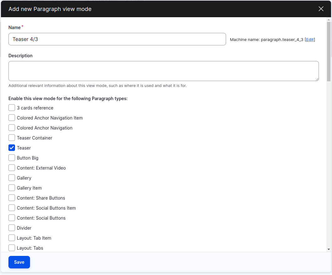
We shouldn’t forget to click "Save."
The new view mode will now be visible in the "Display mode" tab of our teaser component.

Now, in the "Manage display" tab, we select the new view mode, choose "Render entity" as the format, and select the appropriate view mode, in this case, "Image 4/3."
This task would need to be repeated for each one of the three new modes. We promise we’re almost done!
The parent component
Now it’s time to create the parent component. We’ve added the basic field for adding the nested component. Once again, we need to create and activate the three view modes for this paragraph. Go to the "Manage display" tab, scroll to the bottom, click on "Custom display settings," and select the three view modes.
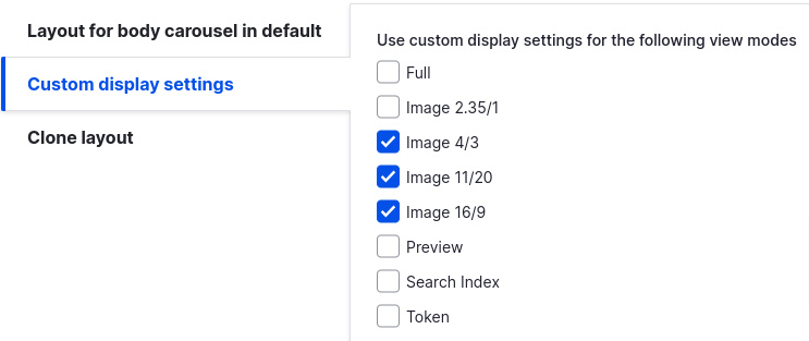
Time to configure each view mode for this container paragraph.

As a reminder, we’d need to select "Render entity" as the format and choose the appropriate child view mode. In this example, it’s "Image 4/3." We must repeat this process for as many view modes as we have.
Great! Now we have everything we need. Here’s where the magic of the module happens.
Let’s create a new field in the container element and select "Paragraph view mode" as the field type. In our case, declaring this new field as mandatory shouldn’t be necessary, but we could do it to avoid further problems. Additionally, we can add a default value for the child teasers' view mode.
Next step consists in going to the "Manage form display" tab. In the configuration for the new field, we select the available view modes (for the parent component we just created).
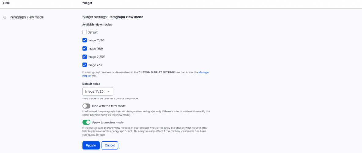
Let’s save our changes, and that’s it! Congratulations, we’ve completed the setup.
Now we can do a test adding the container element as content. The selector should appear with the values needed for the three required view modes.
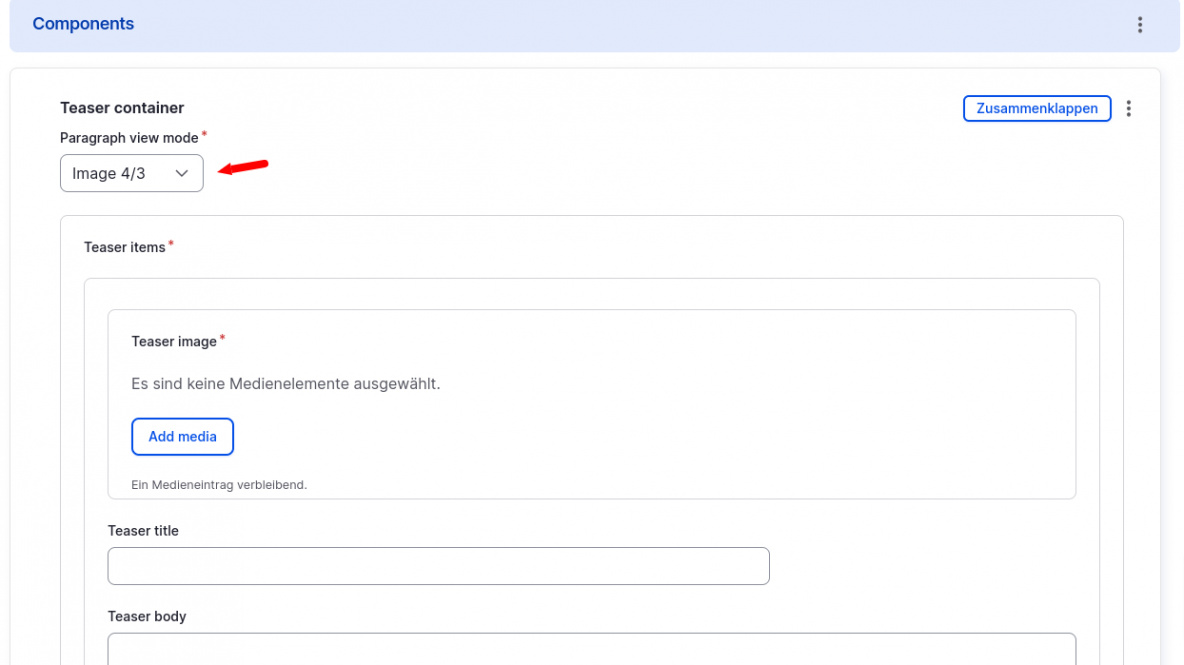
If not, we should review the steps to ensure nothing was skipped. It’s easy to miss one since the process is somewhat mechanical.
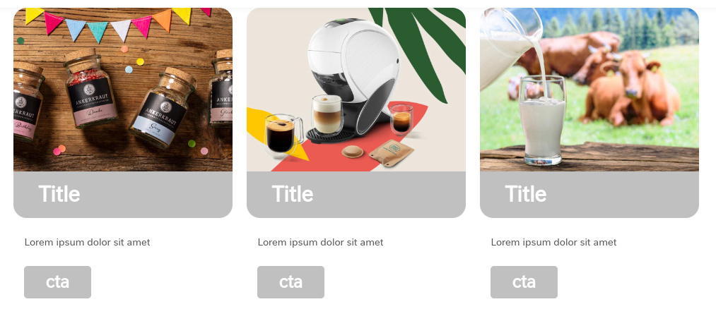
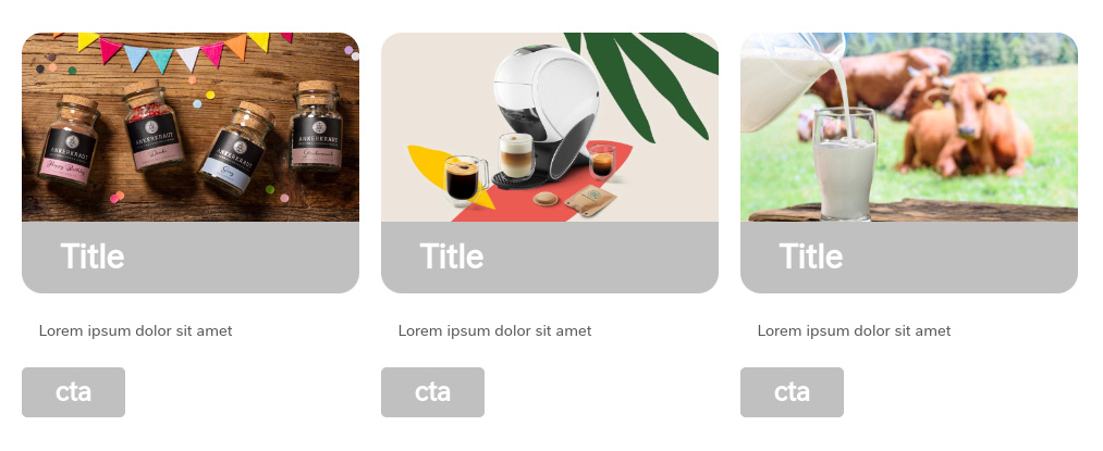
Now we can select all the image ratios centrally from the parent element for all the nested teasers. From here, we can customize the parent and child elements as we wish.
Conclusion
By following the steps outlined in this article, content editors can be empowered to manage nested paragraphs efficiently and ensure visual consistency across our content. With the help of the Paragraph View Mode module, selecting display settings becomes a centralized task, simplifying content updates and reducing the potential for errors.
This solution highlights the importance of flexibility in Drupal’s content management system, offering a streamlined workflow for managing complex components. Whether you're a developer looking to optimize your site’s performance or a content editor aiming for simplicity and consistency, this approach can make a significant impact on your Drupal projects.


